Passport to Paris is a trio of exhibitions focusing on French art from the 1600s to the 1900s. The Denver Art Museum has taken advantage of this French focus to shed light on not only the diverse painting styles and subject matters of these three centuries, but also the furnishings and costumes that reflect the changes French society and culture underwent during these very distinct eras. What better way to create a sense of context than by surrounding the paintings, drawings, furnishings, and costumes with interiors and design elements that evoke the tastes of the time period? The curatorial and education teams worked diligently with exhibition designers Ben Griswold and Kat Perez of Spatial Poetics and graphic designers Matt Rue and Kyle Russell of McGinty, Co. to determine what immersive environment would best suit the objects on display in Passport to Paris.
Fifty masterworks from the Wadsworth Atheneum are on view in Court to Café, where the design team focused on highlighting the transitions in styles and taste from the 1600s to the 1900s. We set the tone as you enter the exhibition for visitors with a coquette beckoning from behind a luscious blue curtain on the title wall. Enter Anschutz Gallery to discover a Monet painting set in a lovely yellow and blue space painted with Benjamin Moore colors Oklahoma Wheat (2160-50) and Santa Monica Blue (776). After listening to a welcome message from DAM director Christoph Heinrich, passing by a buttery velvet curtain, and immersing yourself in period music, visitors’ journey to France really begins.
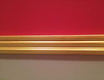
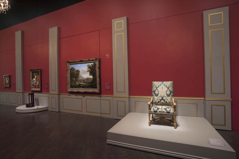
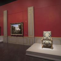
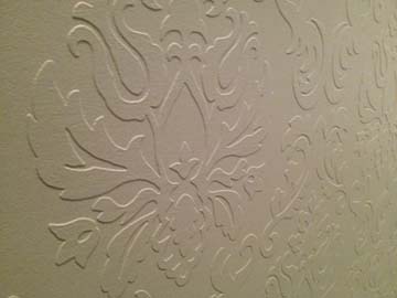
We begin our narrative in seventeenth-century France, where the rule of the French king was absolute. Because King Louis XIII and his son Louis XIV determined every aspect of French society, including style and taste in art, décor, and dress, we used the Throne Room at the Palace of Versailles for our inspiration in this gallery. The walls are painted a rich red (Benjamin Moore’s My Valentine, 1330) with gray columns (Benjamin Moore’s Willow Creek, 1468). The columns were accentuated by stencil artist Kristin Hammer with highlights in metallic gold paint (Modern Masters’ Pharoah’s Gold, ME660). Sparkling chandeliers, oversized murals of the King and court, and embossed paintable wallpaper by Graham & Brown complete the royal effect.
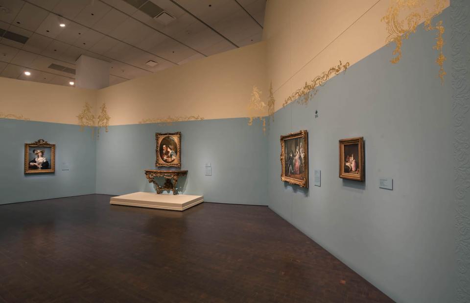
The next space is stunning, modeled after rococo style interiors. Textured wallpaper painted in a flirtatious light turquoise (Benjamin Moore’s Blue Rapids, 745, accented by Norfolk Cream, 261) and an oversize mural of a luxurious ball room welcome you to a new era. After the reign of Louis XIV, the court moved from the country palace of Versailles back to Paris. Nobles and the wealthy upper classes built lavish residences, replacing the large halls of the previous century with a series of smaller, more intimate rooms. These seductive spaces are recreated in our own galleries, complete with metallic gold flourishes drawn from eighteenth-century interiors. You will notice how the undulating lines of these decorative elements reflect the complex organic shapes of the furnishings in this gallery.
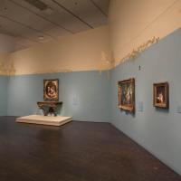
This flirtatious tone was countered by the moralizing movement of the age of reason. Critics of the sensual and flighty rococo tastes were intellectuals who championed a lifestyle and art with a moral agenda. In this space, we’ve selected a subdued hue to reflect the subdued size and subject matter of these moralizing works (Benjamin Moore’s Bainbridge Blue, color number 749, accented by Westwood Tan, color number 256).
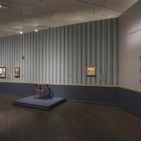
With fanfare, visitors are welcomed to the 1789 Revolution, and our color scheme represents this pivotal moment in French society and reflects a new generation of artists who challenged the monopoly of the academies. While the academies were still very much an active force that dictated social norms and promoted idealized and historic subject matter, some artists sought a more truthful and realistic representation of the world, rooted in their direct experience and painted in a freer, more spontaneous manner. The interior we’ve designed for this space was inspired by images of interior decoration of the Empire Period. Putty and green (Benjamin Moore’s Abingdon Putty, color number HC-99 and Kennebunkport Green, HC-123) walls are highlighted with complex hand-stenciled panels, painted by Karin Mirick. The stencils were specifically selected from a source that specializes in historic architectural details. The paintings in this room and the accompanying furnishings and costume represent both the exhilarating beginning of a modern era and the dramatic end of the old régime
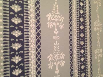
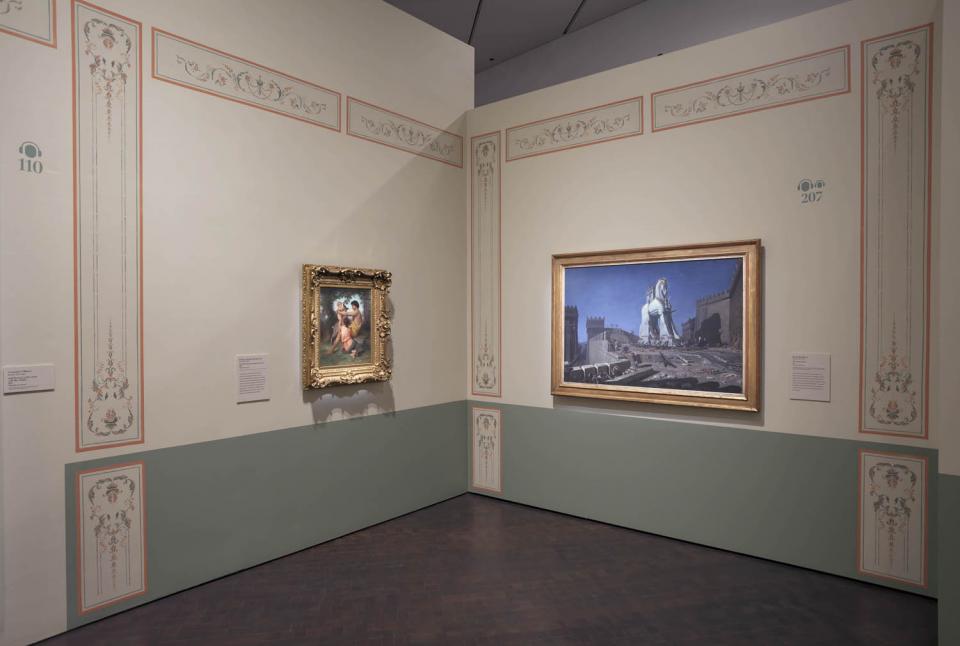
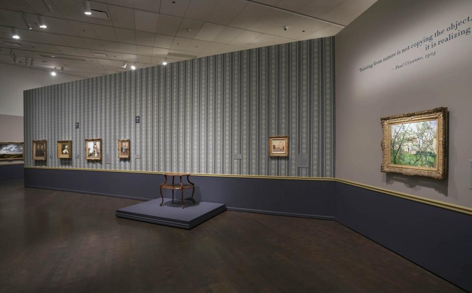
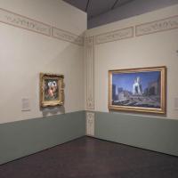
Visitors continue into the "modern era" of the late 1880s with an image of the Eiffel Tower under construction, and a Paris that had recently been transformed from a medieval labyrinth of narrow streets to a grand metropolis of parks, public spaces, and magnificent boulevards. Artists became immersed in this new environment making urban scenes and contemporary interiors de rigueur. The DAM's modern Paris is modeled after bourgeois interiors, with velvety gray walls (Benjamin Moore’s London Fog, 1541), a yellow chair rail (Benjamin Moore’s Westwood Tan, 256), and an elegant wainscoting in saturated indigo (Benjamin Moore’s Blue Gaspe, 1435). Interior scenes of modern life are accentuated with striped, ornamented wallpaper by Adelphi (adelphipaperhangings.com), painted and hand-stamped using the same technique that was used in the nineteenth century.
We hope visitors enjoy their visit to France as much as we enjoyed developing an immersive design concept that evokes each era. Art, after all, is not created in a bubble, and we acknowledge through our exhibition design that politics, society, music, and art reflect and affect each other, and as each element morphs and changes, they grow into eras that become distinct.